2009-04-09
2009-04-07
Parti : program
 In the program parti I used single line to indicate the public area which are the court yard and the Terrance. the doubled line indicates the enclosed area which in side of the house.
in the enclosed area, I used different levels of shading to indicate different function or privacy level of rooms, as the shading shows, the darkest part is the bath room., then two bed room, kitchen, service area, then living room, at last is the entry foyer, and I think there should be a privacy differences between the two open area, as the court yard only have one access which is from the kitchen, but there are 4 access for the Terrance which are stairs, bridge, main entrance and the living room glass door.
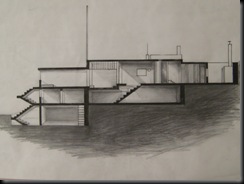
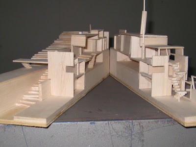
 I found that the whole system is quite hard to understand just form a plan, as it has 3 levels, and each level has different structure wall, so I think it's necessary to show the interrelationship of levels and rooms in the section diagram, we can see at the lower level is the garage then the guest's room and storage place then the cellar. it shows the whole architecture system and inhabitation in this house.
Gary varies floor levels and ceiling hight taking advantage of the resulting section difference to accommodate storage and admit nature light.
Parti : Criculation
 I did this type of drawing for indicate my understanding in circulation, as I was inspired by a phenomenon that's if there are a lot of people walk pass a piece of grass at the same pathway, as this process goes along, the path way will sag into the ground.
 With this idea, I shaded the plan and lighting the path way which I think it should be frequently used, path which is for bedroom and bathroom has been shaded a bit just to help to separate the main circulation and sub circulation.
 If the plan gives the idea of horizontal circulation, so the section shows the vertical circulation, it shows the relationship of these three levels and how people can going to different rooms and levels.
 I give this shape a little bit volume as well as the quality if liquid, as I want to present the nature circulation which is running around this house.
Parti : Enclosure
 Looking at the openings, there are 2 main openings in Eileen Gary's house. one is on the eastern façade, behind this long window is Gary's bedroom and his servant's bedroom. this opening allowed her and her servant enjoy the rising Sun. Another one is on the Terrance front which has 2 glass door , in order to have a good view when standing inside of the living room.
The rest of the house was simple equipped with small windows. the most private and enclosed area is the bathroom.
 On the lower level, Gary actually elevated the whole floor and designed the stripe window to help the ventilation for the Garage and the celler.
Parti : structure

Gray devised a columnar grid in relation to the existing basement of the building, but varied the expression of each column according to it's local condition.  Unlike Le Corbusier, Gray actually rejected the separation of walls and columns which inherent to the free plan. So she reduced the number of free-standing columns to two. one in the entry foyer and another one is in her bedroom.
But in her house these free-standing columns appear to be isolated element rather than component of a system. For example, she attached a pivoting mirror to the bedroom's free-standing column , making that structure member a function component of the dressing area.
 Unlike Le Corbusier, Gray actually rejected the separation of walls and columns which inherent to the free plan. So she reduced the number of free-standing columns to two. one in the entry foyer and another one is in her bedroom.
But in her house these free-standing columns appear to be isolated element rather than component of a system. For example, she attached a pivoting mirror to the bedroom's free-standing column , making that structure member a function component of the dressing area.
2009-04-06
Subscribe to:
Comments (Atom)


